Update: I have launched a membership program for Maackia! I don't do this lightly, but I really enjoy working on these newsletters and all of the other creative outlets I have dabbled with over the last year. So much so, that I would like to spend even more time on them!
The pitch is simple:
Nathan, I want to see more of your weird creativity in the world!
With your subscription, I will be able to spend more time working on Maackia, garden recipes, plant lists, YouTube videos, and resources. All of which will remain freely available on the website.
You will also receive Muga, a bi-weekly newsletter on Sundays. The purpose of this newsletter is to be a contrast to Maackia — a breath of fresh mountian or ocean air. You won’t find thoughts or other detailed gardening information inside. Instead, you will receive nature or landscape photography and a haiku.
A small thank you for supporting my work.
If you would like to change your subscription, head over to Maackia and click on the subscribe button. At the bottom of the page you should see "Already a member? Sign in". Clicking "Sign in" will send a log in link to your email address, which you can then use to change your subscription. If you have any issues, please let me know.
Thank you for being a part of this meandering journey – I am really excited for spring!
I remember in the seventies thinking about an interview I had read with Howard Hawks. He said that, after years of experience, he could get a cowboy off his horse and into a bar in three shots. He wanted an economical use of time while maintaining a visual logic. He could not conceive of simply cutting from the cowboy riding into town to a shot of him at the bar; he wanted the narrative connection. Not dissimilarly, I wanted the viewer to be able to move their attention through the space of my picture. Where Hawks was after narrative continuity, I wanted a spatial continuity.
Stephen Shore (How America’s Most Cherished Photographer Learned to See - The New Yorker)
What story does your home tell? Whether we are aware of it or not, our homes tell a story to everyone. Particularly if they visit. Taking the quote above and applying it to a home, the first shot would be arriving at the house on foot or, more likely, in a vehicle. Think of a movie where the camera is set up across the street where it watches as a car slows down and pulls up into the driveway. The second shot would be of the person exiting the car, and either walking towards the front door along a pathway, or into the backyard through a smaller pathway alongside the house. Finally, the last shot would be of the person arriving at their destination: inside the house or the backyard.
These shots are instructive when it comes to garden design. More importantly, they can help us frame and assess the “spatial continuity” within our space.
The first shot requires large leading lines or structures that grab our attention, simply because we are likely travelling within a vehicle at a rapid pace. If the cue to your home is small or intricately detailed, it will likely be missed by someone passing by at 60km/hr (think about house numbers by a main entrance that are obscured by trees or shrubs).
Your home is a large landmark, but, unfortunately, it is only a landmark if it is distinct from its neighbours. Similarly, driveways are large leading lines pointing towards a home. But they, too, can get lost in the repetitiveness of suburbia. Both of these examples are great at leading a visitor to their destination, but they do next to nothing to help someone visiting for the first time find your actual house. They probably don’t know what it looks like, or the intricate details that make it different from every other house on the street.
Instead of trying to make your home eccentric, you could instead think about how to frame specific shots of your house from different angles. Is there a way to limit a field of vision so that it makes it easier to identify a house number, for example? Or, maybe you want to create a clear viewpoint of your front door that has a strong contrasting colour. Think about what you are trying to communicate with this first shot: identification. Then work backwards.
The second shot requires smaller leading lines, but they have to be just as obvious as those found within the first shot. Luckily, most houses have entryways to the front door and into the backyard. But this can also create confusion depending on how the space is laid out. For example, if the pathway leading to the backyard is larger or more obvious than the one leading to the front door, visitors may be mistakenly led into a space where you do not want them. And what happens if your parking area is removed from the main entrance or can’t be seen from the parking area? Confusion!
Instead of trying to create a border garden along your pathway with lots of seasonal colour, think about what the purpose of this shot is: transitioning from the busy street to a quieter, more private setting. How do you create a sense of separation and safety from the street without completely removing yourself from it?
The third shot is about arriving at your destination: inside the house or the backyard. There isn’t much a garden can do inside your house, so let’s think about what will be the most difficult part of this exercise: how to reconcile the first shot with the second.
Think about it. They are almost completely at odds with each other. The first shot should have an almost tunnel-like view to some kind of identifying feature of your house, while the second shot is supposed to create a sense of separation from the road itself.
There isn’t an easy answer to this problem. You will just have to work through some creative solutions for your space. However, I would start by identifying the perspectives you are working with in each shot. Maybe begin working on the first shot until you have some kind of solution. Then put the problem down for a while and then return and work on the second shot. Once you have a solution for it, take the solutions for both shots and see how they overlap with each other. Are there any conflicts? It might take a few tries, but garden design is, at its roots, an iterative process.
Have fun!
n
design prompt: Spatial Continuity

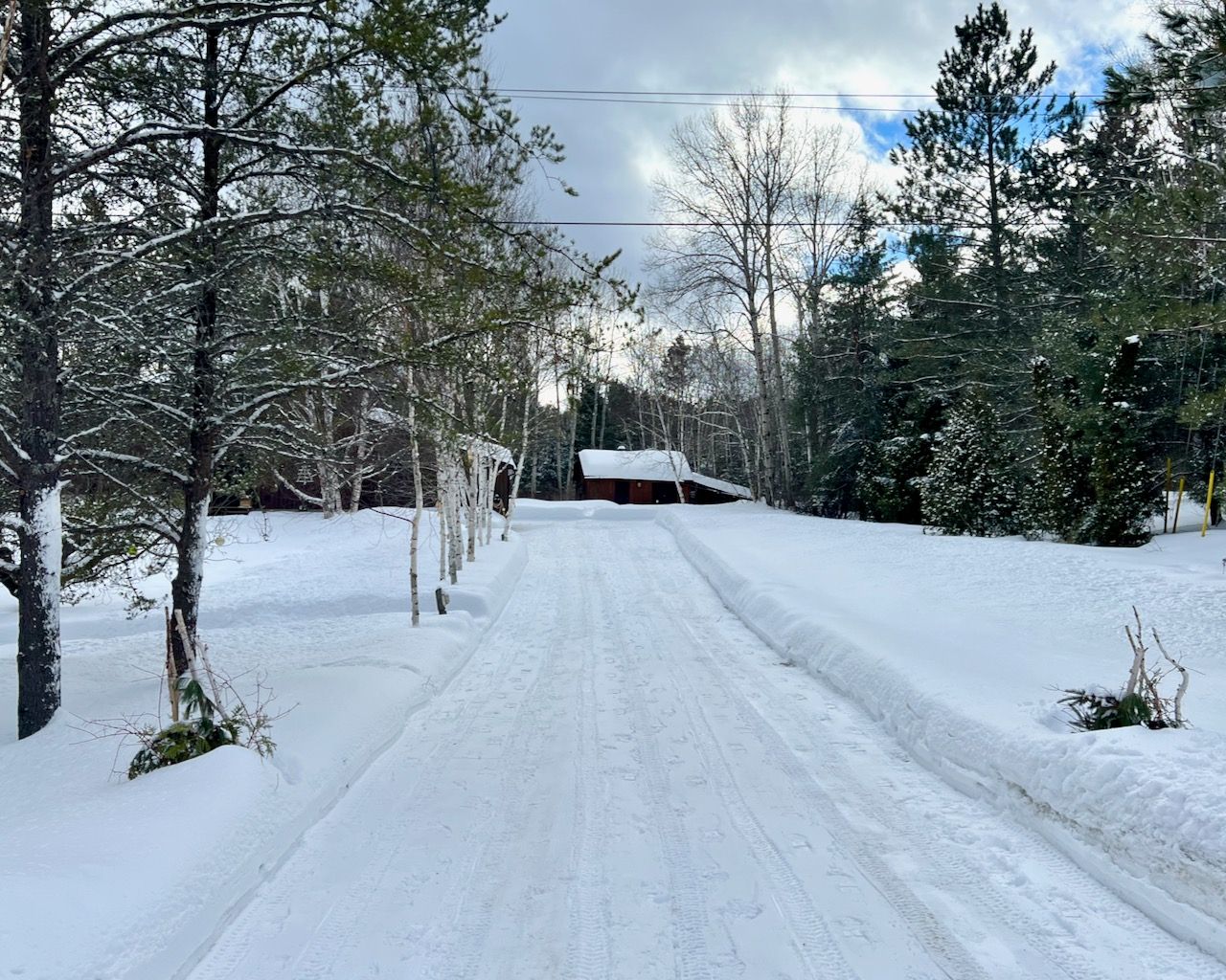
I struggle with spatial continuity in my space as it is a typical rural Ontario property. You can’t really see the house from the road, and the only thing identifying the property is a small green label on a metal post in the ditch, which is surrounded by volunteer plants of all shapes and sizes. In fact, the only building you can see from the road is the shed, which, I feel, adds confusion to the space instead of clarity (is that the house?). The driveway doesn’t look particularly interesting either. The only thing of note are two rapidly decaying barrel containers at the main entrance from the road. They bring a tiny bit of interest, but I don’t find them overly effective. The other main “feature” is a row of birch trees line the driveway (a little too closely). They are excellent for creating another strong leading line up the driveway, but again, they point your eye to the wrong building.

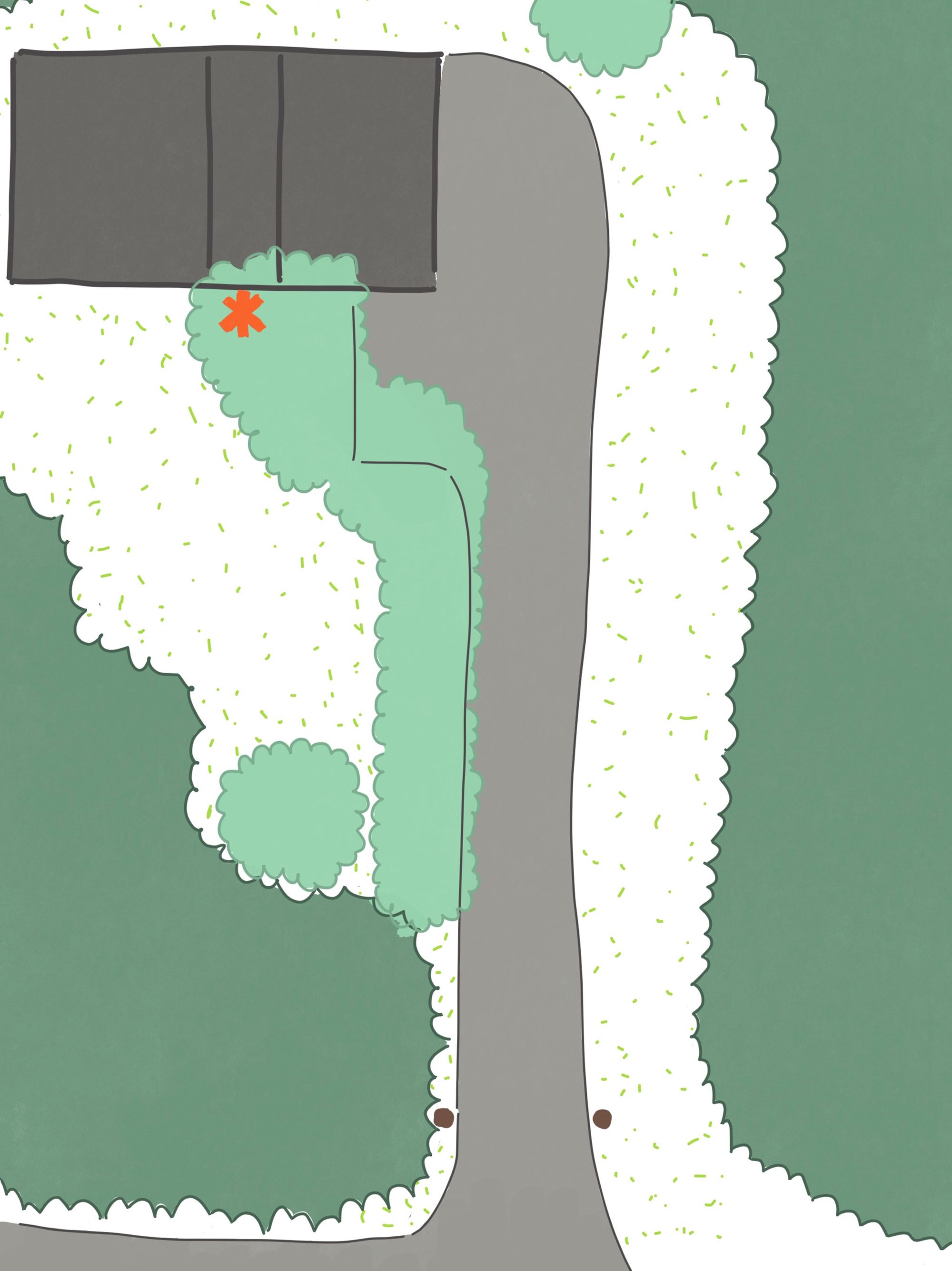
My transition shot has problems too. The front yard looks too much like town, with it mostly being dedicated to lawn. Separation from the road isn’t an issue, as the house is a good way back, but the space feels out of place with its surroundings. The guest parking area next to the house is located under mature birch trees (yikes!) and the pathway leading to the front door (orange symbol) is narrow and made from basic square pavers that heave in the winter. This means that the main pathway to the house is blocked by parked cars and becomes even less obvious from the driveway.
Put together, the space feels constricting, disjointed, and somewhat claustrophobic. I would like to make it feel lively and full of surprise without being disconnected from its surroundings. That’s my goal, anyway.
Your design prompt for the month:
What story does your home tell? Try walking through the three different shots in your space, maybe even take a photograph or two to add a layer of separation. What kind of leading lines are there in the first two shots? Are they effective, or could they be changed to create more impact? How does the space feel?
Maackia 011: Telling a Story
Hi! I’m Nathan Langley and this is Maackia, a monthly newsletter on narrative and spatial continuity!