Maackia 012: A Stroll Through My Front Yard
Hi! I’m Nathan Langley and this is Maackia, a monthly newsletter on my front yard!
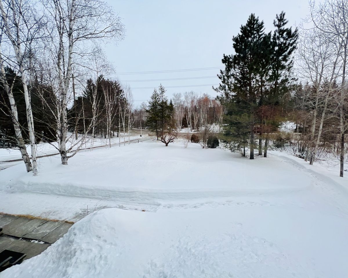
I’ve been sketching a lot this past month, trying out different ideas on how to address some of the issues I identified in the last newsletter. I haven’t gotten down to the detail stage yet, but I thought I would share what I have come up with so far. All the drawings are rough and not to scale.
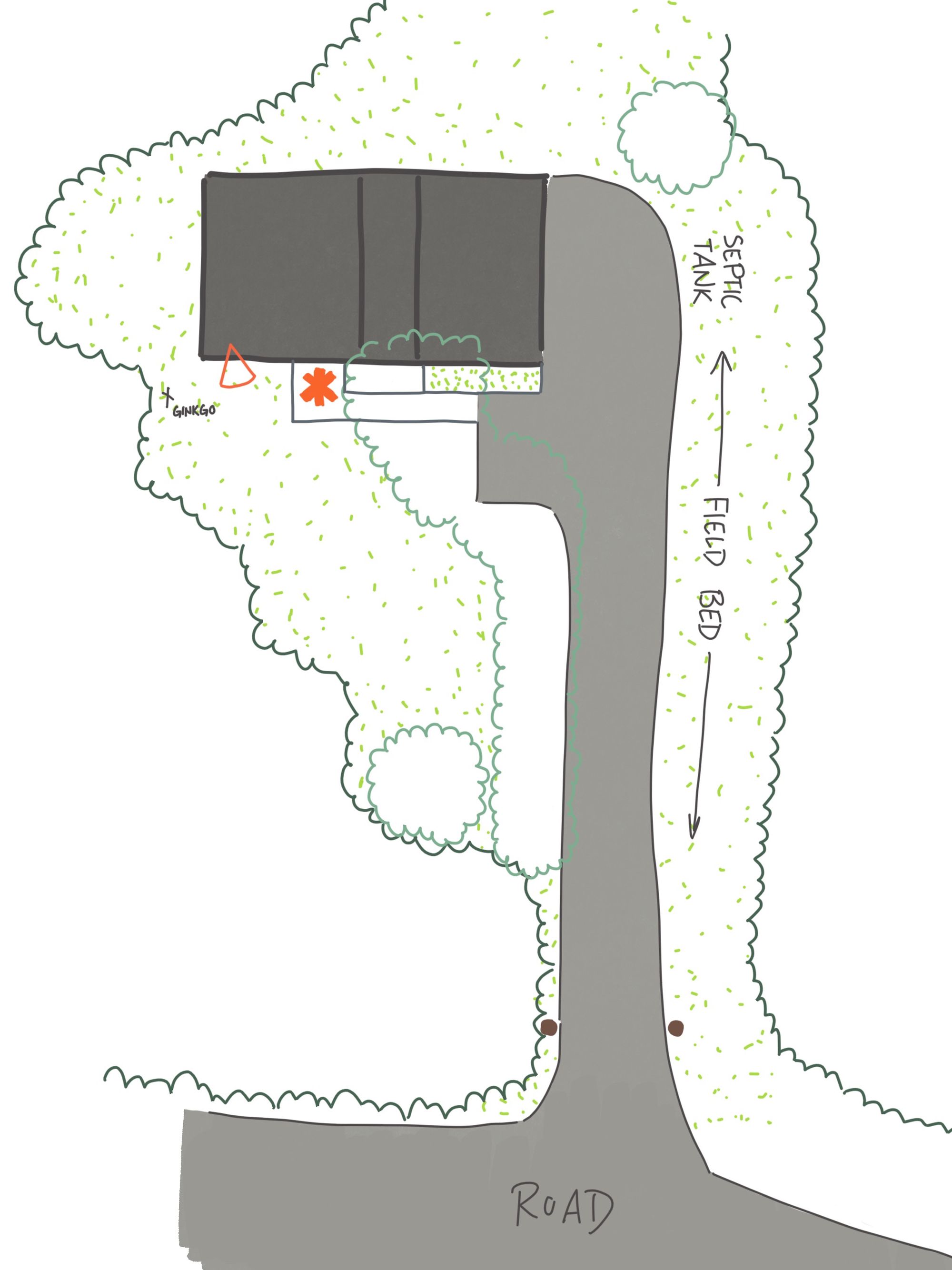
First, I began by adding a bit more detail to the drawing I created last month (where the main pathway is located, the septic tank / field bed, and a small Ginkgo tree that I planted when I moved in). I also identified the main perspective looking out over the front yard from inside the house (the orange wedge shape). The picture at the beginning of this newsletter was taken from that window.
The most obvious thing I noticed in the photograph is that the frame of the image is pulling my eye towards the crab apple tree. It is bordered by two groups of trees of a similar size, and it has a bit of an evergreen backdrop, with the jack pines in behind. The road also has a strong pull, as does the driveway to the left, and the power lines (to a smaller extent). However, my temporary pathway loop through the snow has the strongest pull, leading my eye through the entire front yard. Without the pathway, my eye would bounce around a lot more and the perspective would lose interest (as little as there is currently).
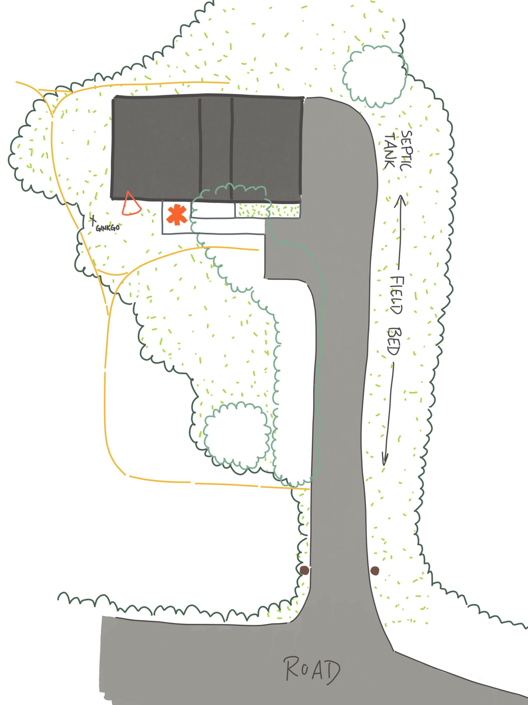
This is what my temporary pathway system looks like right now (yellow line). I have a loop in the front yard that connects with the driveway, and another section that connects into the backyard. What I have discovered this winter is that I would like to incorporate the strolling loop (at least) into the nicer time of the year and then build off of that. It adds something positive to the space, both visually and when I am actually walking around outside.
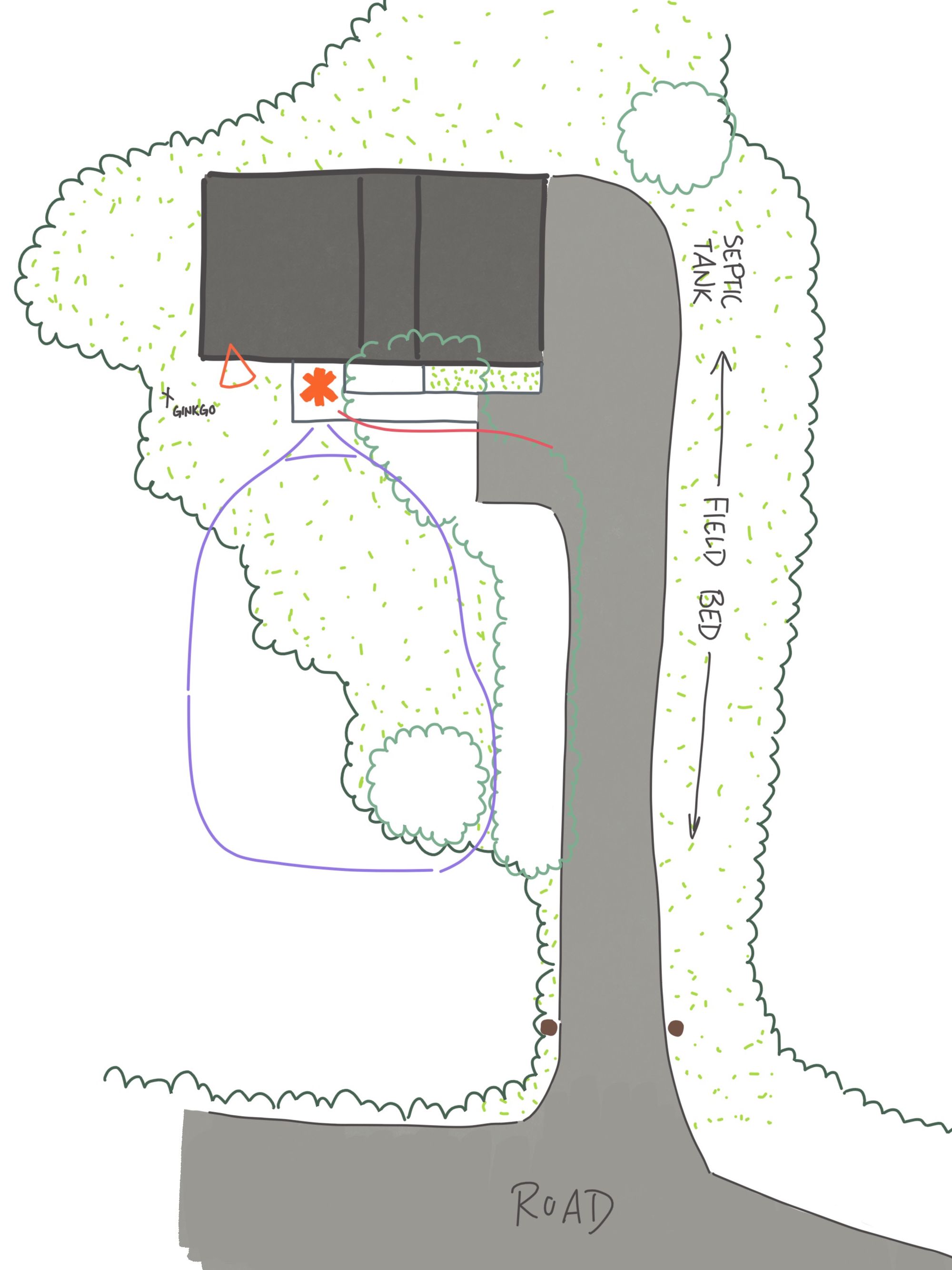
The summer loop that I want to create (purple line) is slightly different from the winter loop in that I brought it back to the house along the row of birch trees instead of tying it into the driveway. This is on purpose. Why? Partly because I haven't liked walking up and down the driveway this winter. But there is a second reason. Let’s return to the idea of different movie shots from the previous newsletter.
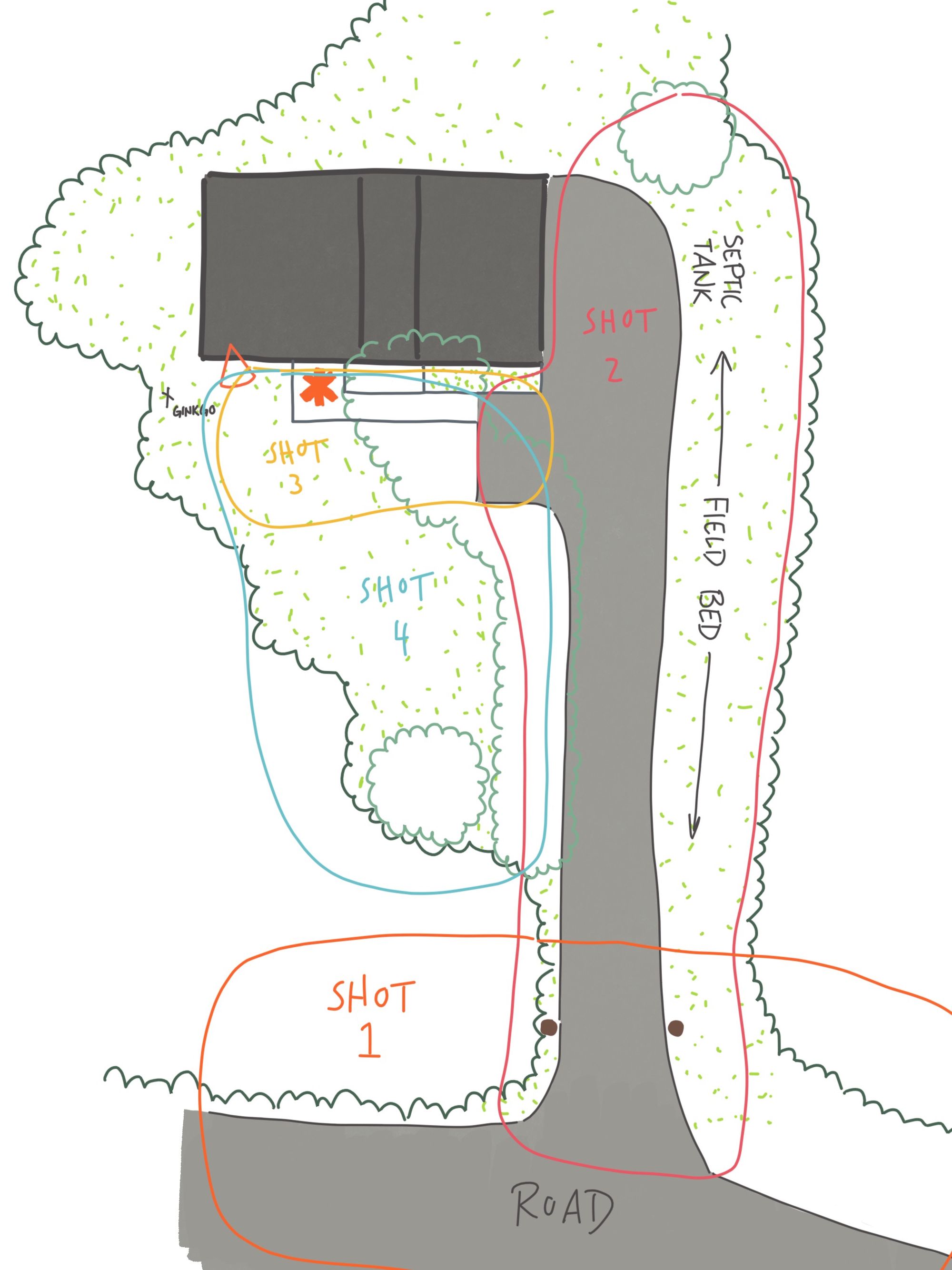
My goal is simple: I want to have distinct areas that don’t give everything away visually all at once. I want there to be surprise with a hint of something different ahead to pull your attention through to the next space. Let’s think of the three shots again. In the drawing above, you will notice that each shot has an area that overlaps with the next. This is how I will achieve that sense of surprise and pull. The overlapping areas are where I will give hints of what’s to come in the following shot. But I will also need to make use of various screens to frame and limit the views from within each shot so I don't give everything away at once.
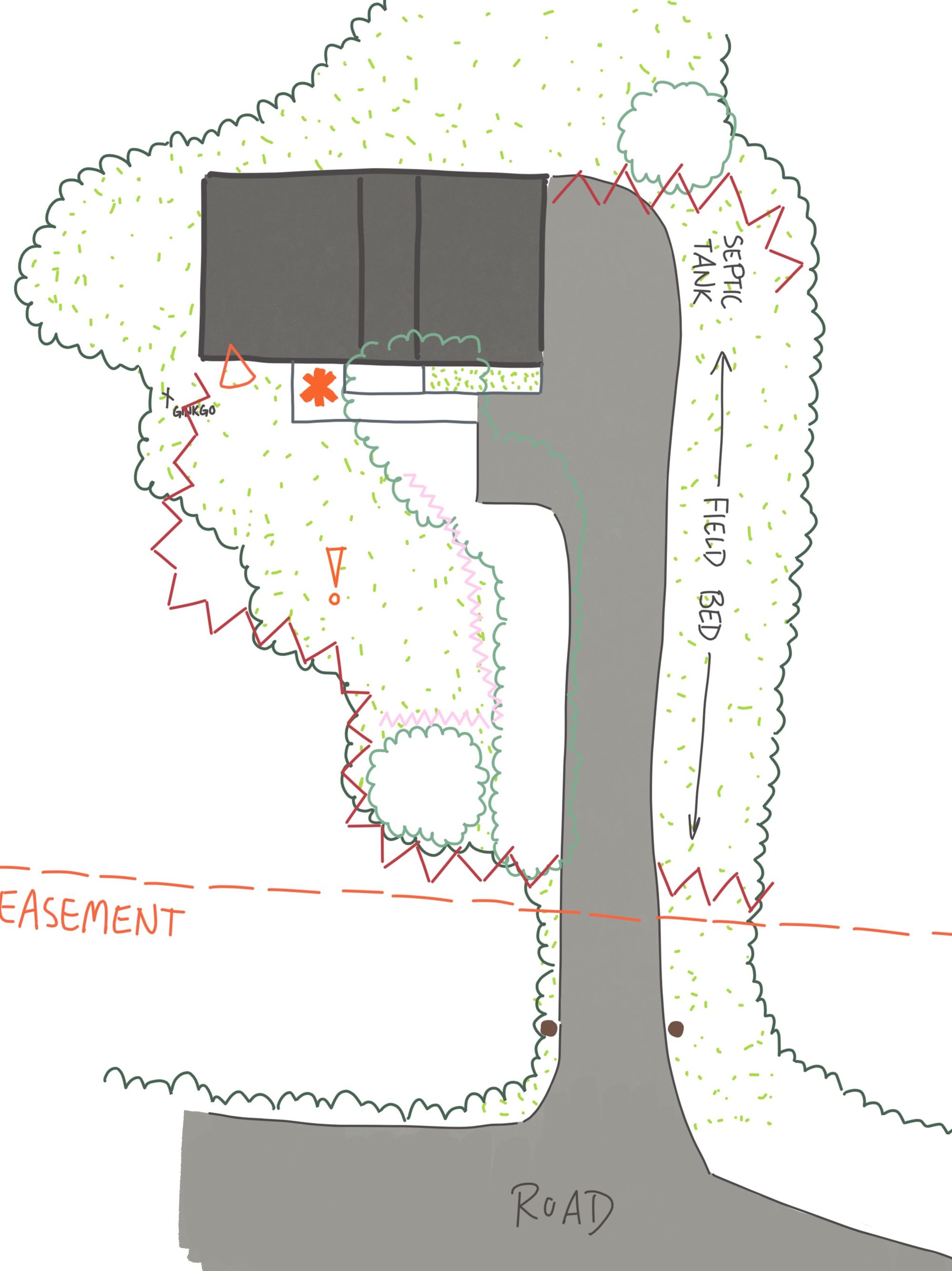
In this drawing there are three new line types: an orange dash (easement), a red zigzag, and a smaller pink zigzag. The orange line is simply there to help me identify where I should spend my energy. Working within an easements can be tricky, particularly when forces outside of your control are working on the area. I don’t really want to spend a lot of time and money building a garden that could be destroyed by the city's maintenance crews or hydro if they decide to do so one day. I’d rather spend that energy elsewhere as much as I can.
The red zigzag is where I would like to have a more permanent evergreen barrier, while the pink zigzag would be a seasonal break using deciduous trees, shrubs, and/or perennials. I don’t want a static frame within this space — the goal is to create a stroll garden, after all. While I will still need to create a defined frame with evergreen barriers to enclose the space, I also want to embrace the seasons and what they will do to the overall look and feel of the front yard. Creating softer barriers with deciduous plants or tall perennials is an effective way to do that as they their shapes are constantly changing throughout the year. So let’s add a bit more detail.
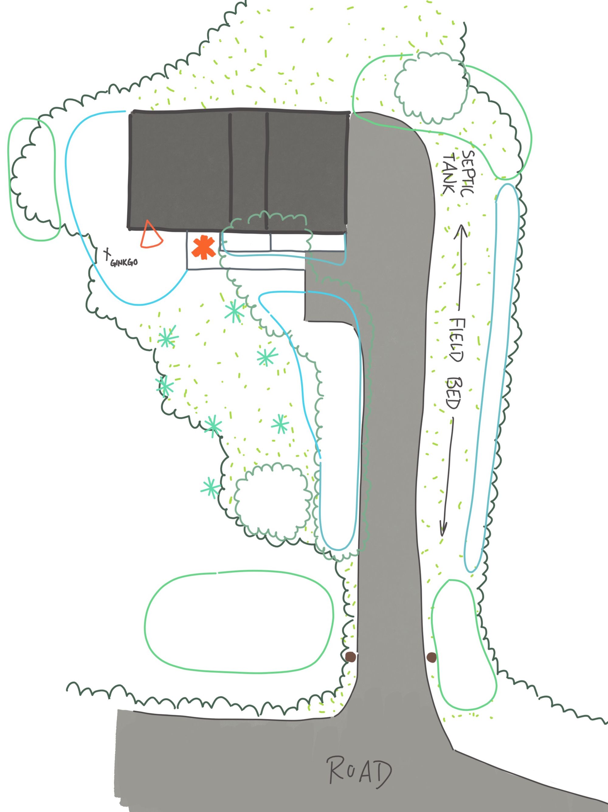
Here is what the space would look like with new trees (teal line & star symbols) and perennial beds (blue line). The new trees (and the small Ginkgo tree) create separation between the front yard and the backyard, and enhance the separation between the road and the front yard. The new trees along the road also complete the evergreen backdrop behind the crab apple when you are looking out from the house. This will add contrast to the space and make the rest of the garden stand out even more.
Next, the perennial beds create structure and contrast to the natural area along the road and surrounding the house. These perennial beds pull you towards the main entrance, and the discrete trees in the front yard (teal star symbols) will create a small sheltered grove. I have different fruit trees in my mind for this area right now. Finally, the perennial bed surrounding the Ginkgo will be slightly different again, as I want to (largely) block the view of the perennial bed at the side of the house from the driveway and main entrance. However, I still want there to be a hint that there is something interesting to investigate around the corner that will make you want to follow the path into the backyard.
Now that I have these drawings completed, I can start chipping away at the different shots I identified. Shot 3 has the most bang for the buck as it is right next to the house, so I will probably start there. I might also work on figuring out where new evergreen trees should go along the road so that they can get established and grow as fast as possible.
What do you think?
n
design prompt: first draft
I struggle with first drafts. My brain really doesn’t like working on something unless I have a solid, well-thought-out plan first (shocking, I know!). But with design, I have an out: sketching.
I was (and still am, to be honest) nervous when sharing my drawings. All of those crits during school probably didn’t help. Neither did being compared to colleagues who had art degrees. But I digress…
Sketching is my short circuit for this problem. I’m not making art. My goal is to communicate rough ideas to myself. That’s it! Even at the end of a project, I am still not making art. I am making blueprints for someone else to read and follow so that they can build what I had envisioned. If you are the one doing the design work and installation, once again, you are only speaking to yourself!
Your design prompt for the month:
Try sketching some ideas down on paper for a problem that’s been on your mind. It doesn’t even have to be garden related! Sit for 15 minutes one day, if you can, and think about what you would like to do to address your problem. Even better, stretch it out over a few days or even weeks.
What would your solution look like? Don’t worry about specifics yet — we will get to that later. Just make some rough sketches, jot notes down, ask yourself questions, and, most importantly, don’t judge anything you produce. At least, not yet, anyway.